30 January 2008

obsessing


i have become slightly obsessed with archer, the newest release from hoefler & frere-jones. the ridiculous number of weights available make it so versatile: it holds up well in body copy and it's gorgeous in large sizes too. i am especially in love with the thin and hairline weights.

i can't wait to get my mitts on this one.

29 January 2008

play with type blog


play with type has a bunch of interesting type experiments.
via the serif.

25 January 2008

london transport museum


i came across this flickr set on the new london transport museum and have been obsessing over the "day trips & hikes" poster. so clean! such wonderful color! what a great 2-color job!

plus, as a bonus, the transport museum offers about 5,000 of their posters in an online gallery. it's nothing short of heaven to me.

24 January 2008

mixed media typography


i love artwork on pages of old books and think this is especially dear.
compliments of ffffound.

23 January 2008

tramp typography


there are a ton of ridiculously cool type videos on youtube. i rather like this one from stevehooley.

21 January 2008

two in a row


i am loving the vintage type here.
(and the beards, of course.)

via ffffound.

19 January 2008

bearded


a little something fun, via jordan.

17 January 2008

sweet


though this is probably not the most flattering photograph of katherine heigl, i love this poster for her newest movie, 27 dresses. what a wonderful, fresh way to play with the movie title and the tons of information required on a movie poster. well done!

16 January 2008

14 January 2008

tauba auerbach


i don't know much about tauba auerbach, other than what i've read (like this), but i so admire her work. beautiful.

12 January 2008

helvetica (again)


you knew it would happen, right? the minute i declare that i typically find helvetica rather dull, i would find a ton of ridiculously cool designs using it.

by god, i think i'm reevaluating my relationship with helvetica. and thinking about using it in a design where it is not mandated by a style guide.

but back to the point: damn, helvetica looks cool on these retro posters, doesn't it?

11 January 2008

(product)red


i admit that i try to be socially conscious. i may fail, but i try. and i am impressed with bono's ability to take an issue that he feels passionate about and create a movement around it, especially one that creates such an easy opportunity for one to take action. like shopping, for crying out loud. who knew you could be an activist and shop? (product)red and edun have taken social responsibility to the mall.

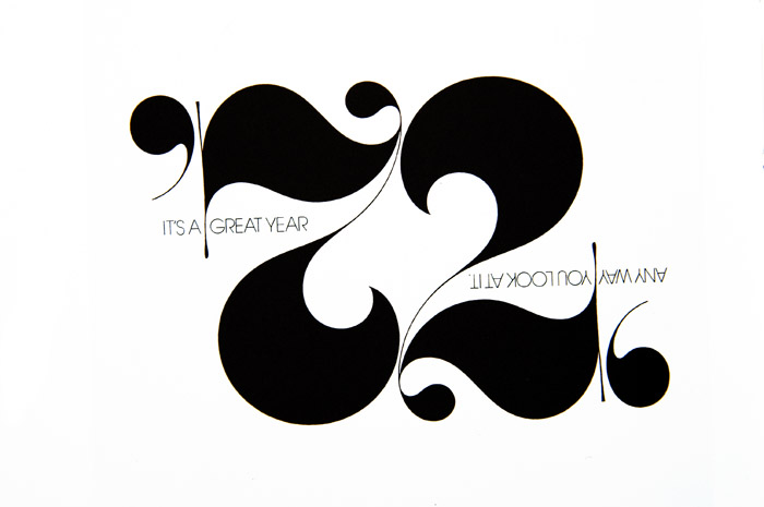
but all that aside, let's talk about the hand-drawn type in this ad. could it be more perfect? talk about communicating (product)red's belief that the simplest personal choices we make everyday can have an impact. not to mention the fantastic illustration. wow.

10 January 2008

herb lubalin

when i was a type student, i did a report on herb lubalin and absolutely fell in love with his work.

his work is classic, elegant, timeless. it looks as fresh today as it did forty years ago.

07 January 2008

soccer and helvetica, in that order


i love soccer. and i just showed my typography 2 students helvetica: the film, so this poster seemed like a good idea (the film is excellent, by the way. rent it if you haven't already seen it). personally, i am generally not a fan of helvetica (it's just so ubiquitous), but i really like it here.

06 January 2008

urban outfitters gift tags


though i'm not particularly fond of the primary type on their website currently, i've kept this gift tag image from urban outfitters for about a year. i love the juxtaposition of the blackletter and hand drawn type.

05 January 2008

fingertype


originally for a brochure, lowman (aka jonathan looman) is in the process of developing a full typeface. i can't wait. it's fantastic.